Branding
Product design

Visual design
Systems design
Making the intranet feel like the organization behind it
At a glance
The product lacked the visual and branding capabilities customers needed to make their intranet feel like their own, and it was becoming a gap.
I identified the opportunity, made the case to stakeholders and led the end-to-end design of multiple initiatives to expand the platform's visual and branding capabilities.
Organizations could finally build intranet experiences that reflected their brand, directly addressing an unmet need.
OPPORTUNITY
Organizations couldn't make the intranet feel like theirs
GO is a B2B SaaS intranet platform, built on Microsoft SharePoint, that enterprise organizations use as a digital workplace for their employees. Organizations wanted their intranet to feel like theirs: more on brand, more modern, and more visually engaging. This was felt most directly by communicators and intranet managers, who typically owned branding and homepage design within their organization and were the ones most constrained by what the platform offered out of the box. At the time, the product's visual capabilities were lacking, and it was becoming a noticeable gap. I led a series of initiatives to expand the platform's branding and layout capabilities, giving organizations the tools to build intranet experiences that reflected their identity.
Building on top of SharePoint meant new capabilities had to extend the existing ecosystem rather than replace it. This was the core constraint I was designing within. Every improvement needed to feel native to SharePoint while going meaningfully beyond what it offered out of the box.
PROCESS
Advocating for the direction
Expanding the platform's visual capabilities wasn't just a design challenge. It required making the case internally. I identified the gap through ongoing customer feedback and brought it forward to stakeholders, framing it around business value and competitive positioning. With buy-in secured, I worked with the Product Manager to prioritize which initiatives to focus on first, weighing customer demand against what was feasible within SharePoint's constraints. I was responsible for defining and delivering on a clear vision: an intranet that looks and feels like the organization behind it.
Key considerations that shaped every design decision
Across all initiatives, a few key considerations shaped how I approached design decisions.
Maintained visual alignment with existing component and layout patterns.
Designed to integrate with existing web part structures.
Customization capabilities accessible to non-technical site owners.
Balanced creative freedom with consistency across pages.
These considerations shaped every layout, component, and branding capability introduced across the product.
solution
Giving organizations the tools to express their brand
I introduced a series of capabilities that collectively expanded the platform's visual language and gave organizations meaningful control over their brand expression.

Layout flexibility
The existing news layout gave communicators little control, and pages felt visually heavy and repetitive regardless of content. I looked at how modern news sites handle dense content to inform a more compact and scannable layout, while also referencing existing SharePoint layout patterns to ensure new options felt native to the ecosystem rather than out of place. That led me to compact and side by side layouts that reduced visual weight and gave communicators more control over page composition. Given the number of layout and configuration variations required, I worked closely with engineering to define what was feasible early, so the final designs could scale across the product without excessive rebuild.

Banner redesign
Rebuilt the banner component to support background images, video, and mobile-specific configurations, working closely with engineering given the number of variations involved, turning it into a genuine campaign canvas.

Section and web part backgrounds
Gave authors the ability to apply brand colours, images, and video across entire page sections and individual components.

Personalized greetings
Added dynamic greetings that recognize birthdays and work anniversaries, making the intranet feel more personal.

Documentation and handoff
Each initiative was supported by detailed documentation covering breakpoint behaviour, content and text limits, interaction states and keyboard navigation, giving engineering and QA everything they needed to implement and validate the design accurately.
outcome
Transforming the intranet into a reflection of their brand
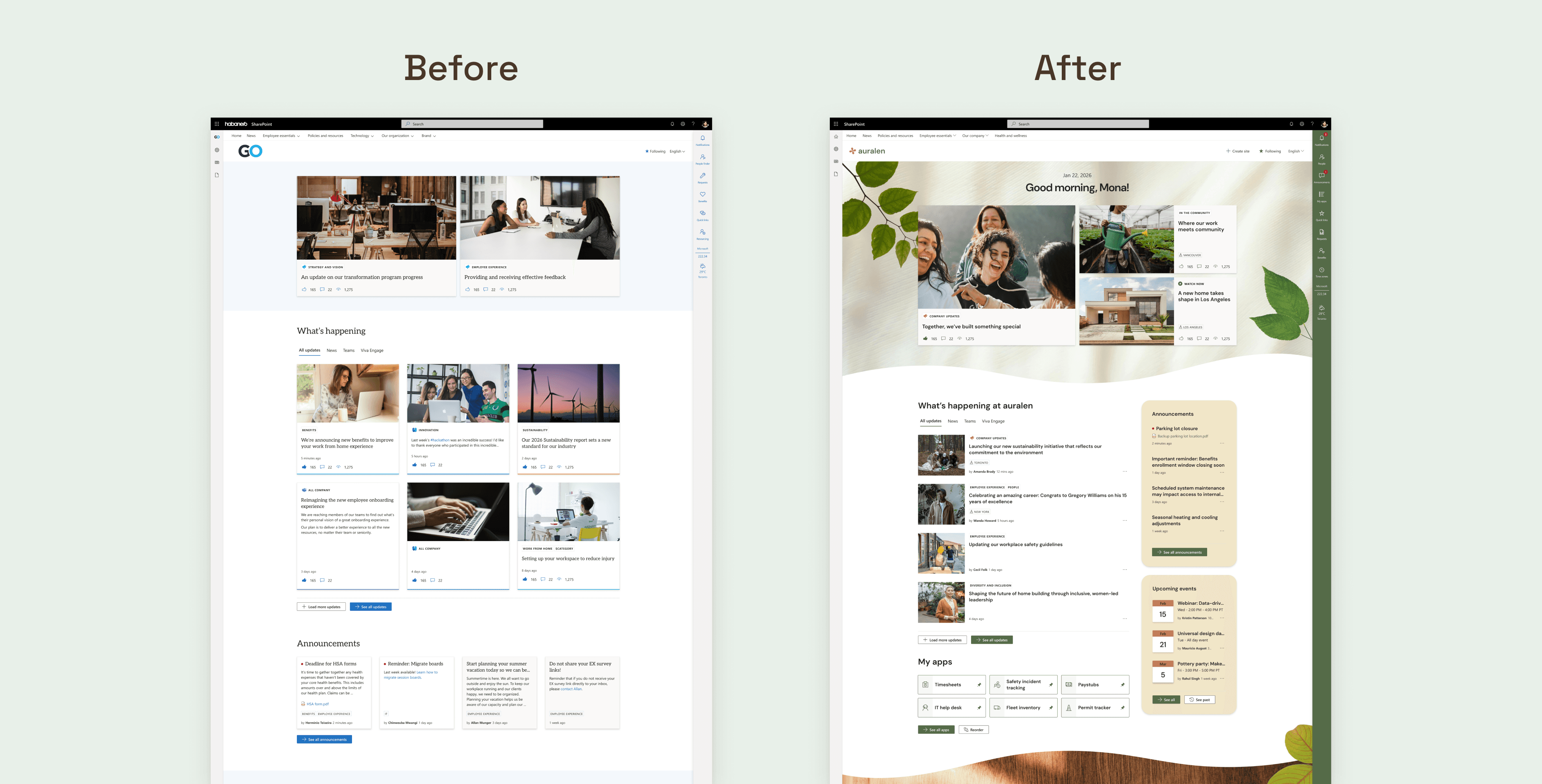
Introducing branding and layout capabilities gave organizations the ability to create intranet experiences that reflected their identity, something that had previously been out of reach within SharePoint's limitations. Communicators also gained greater flexibility in how they structured their pages, reducing scroll and making homepages feel less repetitive. Internally, our designers who worked directly with clients to translate their brand into the intranet gave direct feedback through design reviews, saying these capabilities made a real difference and gave them far more room to design effectively within SharePoint's constraints.
REFLECTION
My learnings and takeaways
Thinking in systems
This project pushed me to design components that were reusable and scalable across multiple features, not just consistent in appearance. It also sharpened my design QA process, teaching me what actually needs validation before something ships.
Trusting my own judgment
Two of these initiatives were entirely my own ideas from concept through execution, which gave me real confidence in my design judgment, not just my ability to execute someone else's direction. I'm proud of how far I was able to push SharePoint's visual language without breaking from it.

