Branding
Product design

Interaction design
Turning a neglected feature into a go-to marketplace
At a glance
A community buy and sell feature with significant usability limitations had led to low adoption, lacking core marketplace functionality employees expected.
Grounded in established marketplace conventions, I redesigned the listing flow and author configuration and designed a new management experience.
The redesign improved usability and flexibility, driving increased adoption and enabling new use cases beyond buying and selling such as job postings.
OPPORTUNITY
A feature too limited to be useful
GO is a B2B SaaS intranet platform that enterprise organizations use for internal communications, including tools to connect employees like an internal marketplace for buying and selling within their organization. The existing buy and sell feature had significant usability and flexibility limitations. It could only live on a single page, lacked core marketplace functionality, and did not align with the broader product experience. As a result, site authors struggled to configure and manage the marketplace, sellers found it difficult to create and track their listings, and buyers had limited ways to discover what was available or connect with a seller.
I led a complete redesign of the experience, defining the end-to-end feature including the listing creation flow, management tools, lifecycle states, role-based views and the authoring configuration experience.
process
Grounding the redesign in familiar conventions
With limited opportunity to conduct customer interviews, I grounded the redesign in patterns from established marketplaces like Facebook Marketplace and Craigslist, patterns users already knew, to reduce learning curve and set expectations. From there, I established a clear order of priorities to guide what I designed first.
Breaking the posting flow into steps, with multi-photo support, image reordering and a preview before submission so users felt confident before posting.
Giving sellers meaningful control over their listings through editing, deleting and setting a status, making it easy to keep listings up to date.
Mobile experience
Ensuring the experience worked across devices since employees could access the marketplace on the go.
Author control
Ensuring site authors could control how the marketplace was set up and displayed and making the feature adaptable to different community needs.
SOLUTION
Designed for clarity, control and flexibility
The redesign addressed the core usability and flexibility gaps through three main areas.
Creating a guided creation flow
The previous experience required sellers to fill out numerous fields in a single modal. I designed a guided creation flow with organized steps, contact options, clear progress and validation, multi-photo submission and reordering, and a preview before posting. The photo reordering experience was new for our engineering team to build, and I worked closely with them to make sure it worked as intended, including make sure it was keyboard accessible for desktop.
Management and lifecycle experience

Designed to work across devices
The listing creation flow, browsing experience and management tools were all designed to work across devices, so employees could engage with the marketplace wherever they were, whether posting a listing from their phone or browsing while away from their desk. Drag-and-drop worked well for reordering photos on desktop, but wasn't reliable or accessible on mobile, so I adapted the interaction to use up and down buttons instead, keeping the same functionality but suited to touch input.

Flexible author configuration
To make the feature scalable, I designed a configurable web part experience allowing site authors to enable or disable features, control listing layouts, and configure display and filtering options.
outcome
A marketplace employees actually wanted to use
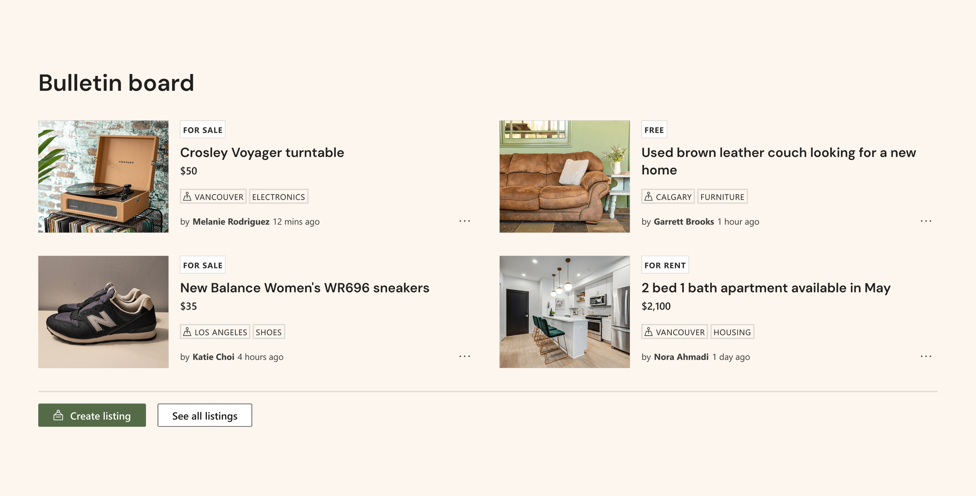
The redesign significantly improved usability and flexibility for both sellers and buyers, removing the barriers that had limited adoption. Its flexible architecture also enabled new use cases beyond buying and selling, including job postings, extending the feature's value well past its original scope.
reflection
My learnings and takeaways
Owning it end to end
I led this feature's definition almost entirely on my own, with little direction, designing new interaction patterns like drag-and-drop photo reordering that I hadn't worked with before, and adapting them for accessibility and mobile along the way.
What I'd do differently
We didn't have the chance to validate the redesign with sellers or buyers before launch. Even a lightweight round of testing would have caught issues earlier and given us more confidence in the direction before it shipped.

