Branding
Product design

UX research
Systems design
Designing a system to keep intranet content current and trustworthy
At a glance
Content owners had no way to track which pages needed review, and employees had no way to know if what they were reading was up to date and could be trusted.
I grounded the direction in established content management patterns, then tested two early design explorations with real users to shape the final direction.
The result was a connected system, adopted widely across customers, including a distributed team of over 120 content owners at SickKids.
OPPORTUNITY
No visibility for content owners, no confidence for employees
GO is a B2B SaaS intranet platform that enterprise organizations use for internal communications, giving employees a central place to find company news, resources and information. Managing page reviews on GO was entirely manual. There was nothing built into the product to help content owners track which pages needed attention or when, so most relied on informal personal schedules, and content inevitably went stale without anyone realizing it.
For employees, that created a trust problem. With no way to know whether the information they were reading was current, it became harder to rely on the intranet as a source of truth.
This came in as a highly requested feature with no formal brief, so I led the work to define what we were actually solving.
PROCESS
Defining our goals and translating those to features
I worked closely with product and engineering to align on goals for this work.
Content owners should always know the status of the pages they're responsible for.
Make it easier for owners to stay on top of review schedules so content stayed up to date.
Signal to employees whether content was current and could be trusted.
Support both individual owners and admins with different permission levels.
While we aligned on all four goals together, product's initial thinking on how to solve for owner visibility was narrower, focused on a page-level component solution. I made the case that a page-level signal wasn't enough on its own, without a centralized view, content owners would still be navigating page by page to understand their overall status, which didn't fully solve the problem. That advocacy paid off, and the dashboard became one of the most valued parts of the feature.
Those goals translated into three areas of work:
• Page-level status component
• Management dashboard for content owners and site admins
• Automated email reminders to keep owners on track even when they weren't checking the dashboard
Reviewing other content management systems
Before designing, I looked at how other content management tools, including Drupal, Contentful and Interact, handled similar problems, so I could build on conventions content owners might already be familiar with rather than introduce something entirely new. A few patterns stood out: list-based views for density and scannability, refiners for filtering, and colour-coded status tags for surfacing state at a glance.
With that foundation, I started with the dashboard, the most complex piece and the one most likely to need real validation before investing further.
VALIDATION
Validating two dashboard directions
I designed two initial layouts for the dashboard rather than refining one direction in isolation. I spoke with content owners within our own organization who understood the problem firsthand, as well as customers who'd been requesting this feature. The goal wasn't to validate a finished design, it was to find out which direction was worth investing in before committing.

Content owner dashboard exploration: Layout one
The first layout used refiners in a side column to filter content. The feedback was clear: the refiner interaction added too much friction for something content owners would be doing regularly, and the layout wasn't surfacing enough information at a glance, details like last modified date and who made a change were also missing entirely.

Content owner dashboard exploration: Layout two
The second layout took a more conventional approach, using tabs for filtering instead of refiners, with additional columns surfacing more information directly in the list. This landed noticeably better. Tabs were preferred for requiring fewer clicks, and the added columns gave content owners the context they needed without clicking into individual pages.
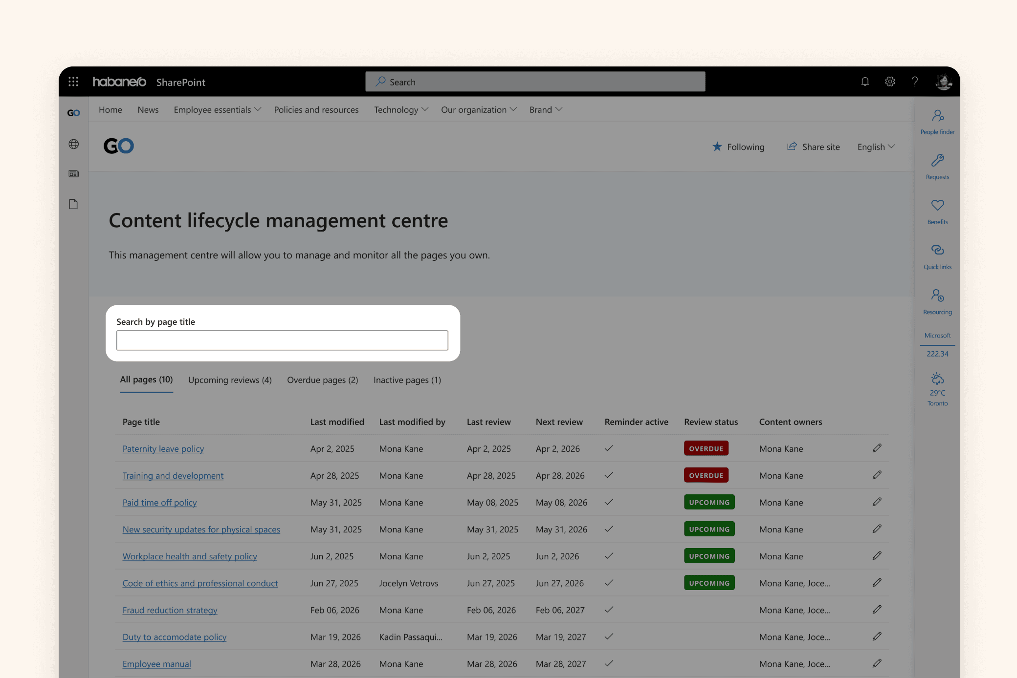
Where search fell short
A few more specific gaps came through as well. Search was scoped to page title only, but content owners needed to search by site and by owner name too, especially useful for admins managing pages across many different owners

Status tags caused confusion
The status tags themselves needed rework as the green on the "Upcoming" tag read as completion rather than a call to action, there was no way to distinguish reviewed content from content that hadn't yet come up for review, and the grey "Inactive" tag felt confusing and added little value.
SOLUTION
A dashboard built on real feedback
These insights shaped a design that addressed fragmentation by bringing saved content, curated links and personalization into one unified experience.

From there, each fix addressed a specific gap that came out of testing:
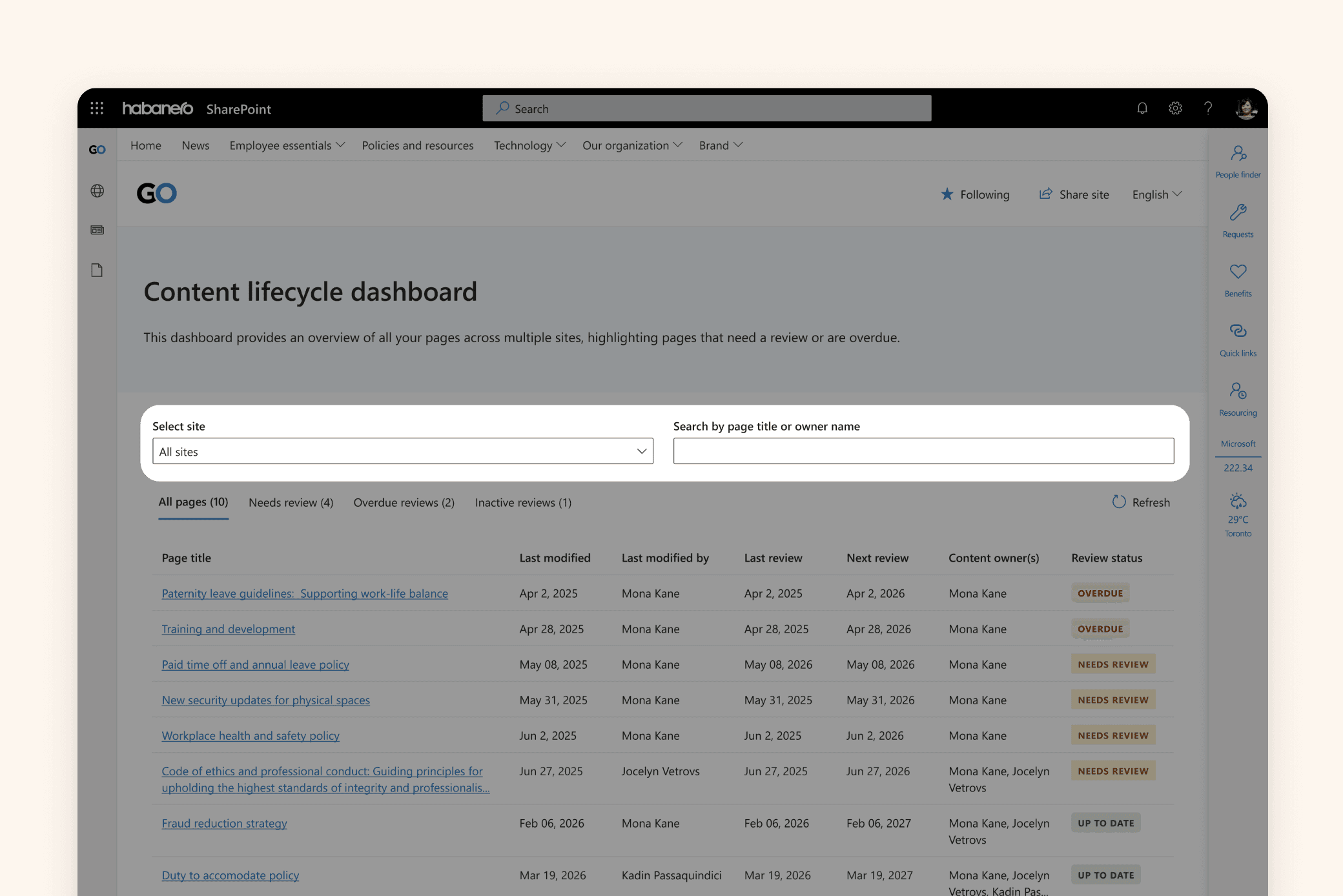
Search and filtering built for real workflows
Added a site dropdown so content owners managing content across multiple sites could scope their view, and expanded search to include owner name, particularly useful for admins who need to quickly pull up all pages assigned to a specific person.

Status tags that actually communicate
Renamed "Upcoming" to "Needs review" and switched its colour from green to yellow, removing the ambiguity about whether action was required. Added a new "Up to date" tag to distinguish reviewed content from content that hadn't yet come up for review, completing a clear three-state system: overdue, needs review, or up to date. The "Inactive" tag was removed as a visual status, since it was creating confusion for content owners, but kept as a filterable tab so admins could still surface those pages when troubleshooting.

A different view for a different role
Admins see the same dashboard foundation as individual content owners, expanded to show every page across the entire intranet, plus two additional capabilities: transfer ownership, letting admins reassign pages between content owners when someone leaves or changes roles, so pages don't go unmanaged, and troubleshoot items, surfacing edge cases like pages where the content lifecycle component was deleted but the review process kept running.
Reassigning ownership without losing track of content
When someone leaves the company or changes roles, their pages shouldn't go unmanaged. I designed a transfer ownership flow that lets admins search for a content owner, select which of their pages to reassign, and choose who takes over. Both the previous and new owner are notified once the transfer is complete, so there's no confusion about who's responsible going forward.

A trust signal for employees, control for owners
On individual pages, a lightweight status tag and next review date give employees a quick, trustworthy signal without extra clutter. Content owners see the same view with one addition, a Manage control that opens a panel to update the review date, reassign ownership, or complete a review.
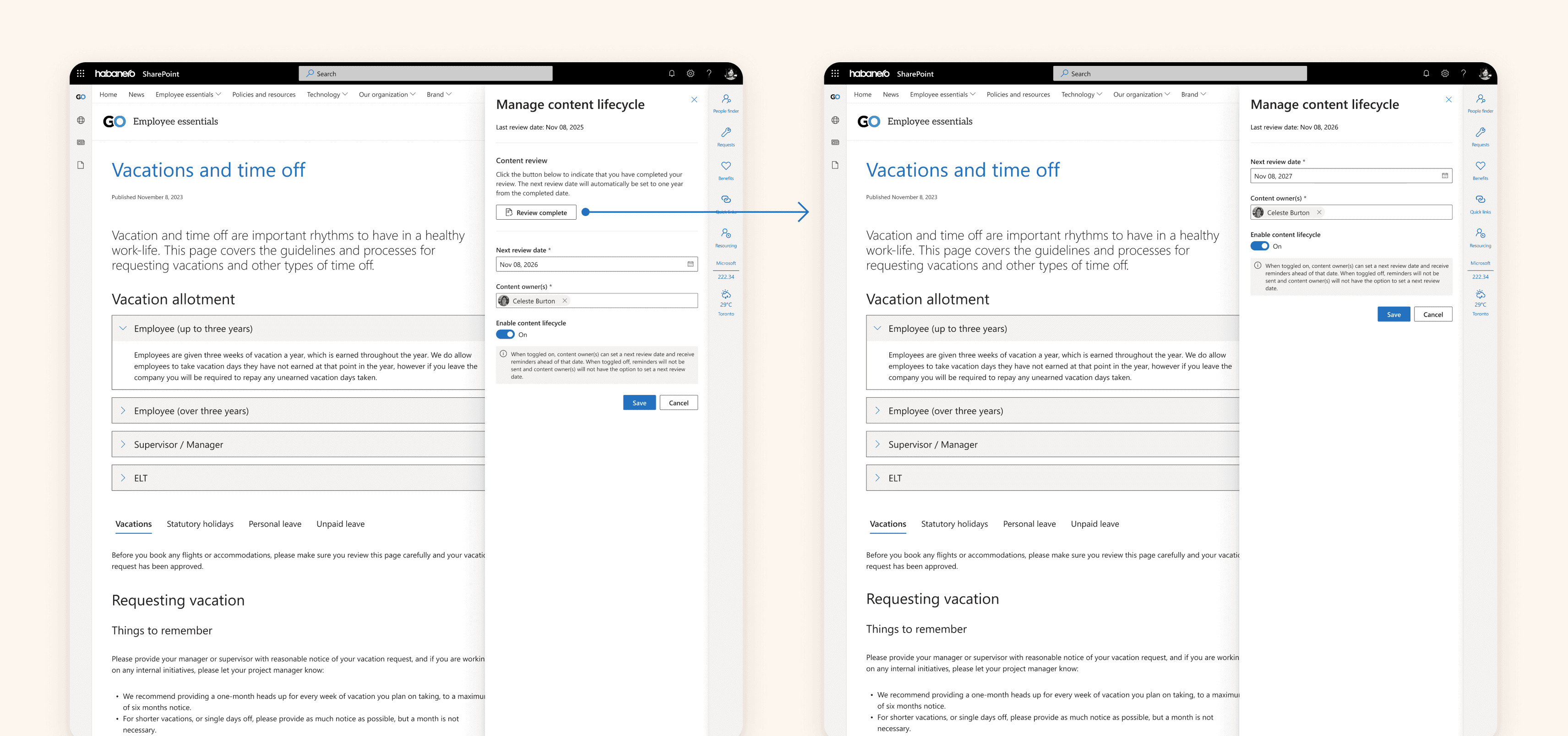
The "Review complete" action only appears within the actual review window, a deliberate constraint to prevent content owners from marking a page reviewed prematurely.
Closing the loop with email reminders
To make the system proactive rather than passive, I designed the original email reminder, notifying content owners when pages are approaching their review date or are overdue, surfacing what needs attention directly in the email with a clear path back to the dashboard. The visual design has since evolved to follow the product's updated email templates, but the underlying logic and content remain the same.
OUTCOME
Content that owners can manage and employees can trust
What started as two separate problems, content owners with no way to track their pages, and employees with no way to trust what they were reading, became one connected system. The dashboard, page-level status component and email reminders work together to give content owners full visibility and control, while giving employees a clear signal that what they're reading is current and reliable.
The feature has been adopted widely across customers. At SickKids, one of Canada's most research-intensive hospitals, it supports a distributed team of over 120 content owners across a large, complex intranet. Content owners receive monthly email reminders for pages due for review, and the resulting dashboard gives them a clear, centralized way to stay on top of it, turning content upkeep into something owners can actively participate in rather than fall behind on.
reflection
My learnings and takeaways
Advocating for the right solution
This was one of the more complex projects I've worked on, with multiple permission levels and a lot of edge cases to account for. I'm glad I pushed for the dashboard even though it wasn't part of the initial scope, since it became one of the most valued parts of the feature.
What I'd measure next time
If I could go back, I'd define clearer success metrics from the start, like adoption rate or how much stale content decreased after launch, so the impact could be tracked more concretely over time.

